


My biggest pet peeve with Run8 is the weakness of the rolling stock visuals and the lack of accuracy in the fonts, and no competitive alternative to solve that deficiency. You land at the mercy of one individual who may live on a different continent trying to model accuracy far away and who does not hit the mark.
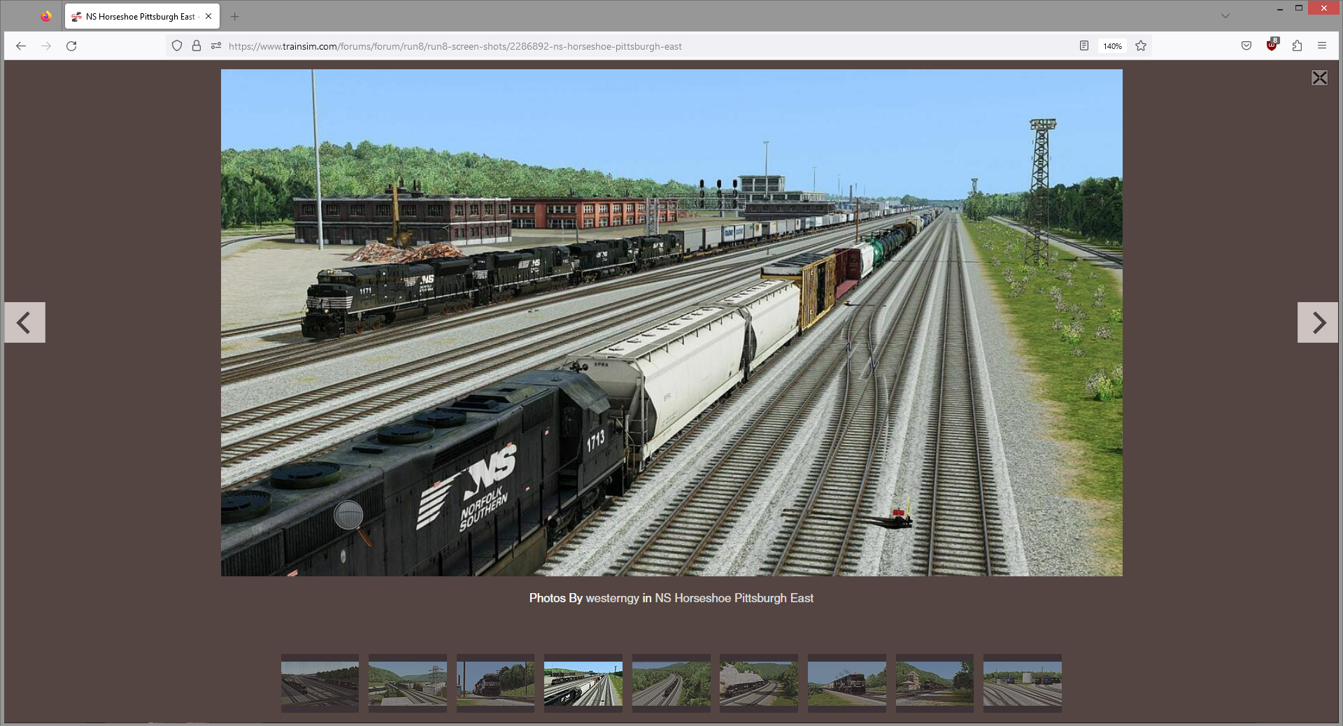
Look at this Run8 screen. I assume that's a SD45-2 in the foreground. But there never was any 1713 on the roster. And I never recall the number 1 on NS ever having a serif, let alone the company using any (universally misapplied in the trainsim genre) arial font.
I do not support anything that boxes users in to one individual's "interpretation"
Look at this Run8 screen. I assume that's a SD45-2 in the foreground. But there never was any 1713 on the roster. And I never recall the number 1 on NS ever having a serif, let alone the company using any (universally misapplied in the trainsim genre) arial font.
I do not support anything that boxes users in to one individual's "interpretation"


Comment